








Consistency at Scale, Every Screen
We build design systems of reusable components, standards, and documentation that keep every screen of your product consistent.
Book a scoping callConsistency at Scale Across Every Screen
Reusable components accelerate design and development workflows.
Unified visual language maintained across products and platforms.
Structured design systems built to support long-term product growth.
Create Consistency Across Every Product Experience
Consistency At Scale.
One System. Endless Possibilities.
Create scalable design foundations that keep products consistent, efficient, and easy to maintain.


.svg)
Scalable Design Systems for Consistent Digital Experiences

From Design Consistency to Scalable Growth — Here's What We Deliver
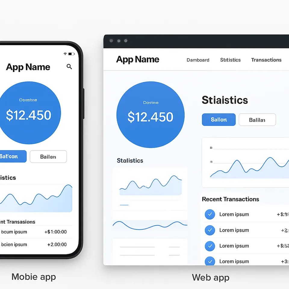
- Consistent branding guidelines
- Standardized UI patterns
- Shared visual language
- Reusable design components
- Reduced repetitive work
- Improved team efficiency
- Shared design-to-code standards
- Simplified implementation process
- Improved cross-team communication
- Uniform interactions across products
- Predictable user interfaces
- Stronger brand recognition
- Easily expandable component libraries
- Governance and documentation
- Sustainable design operations
STEP 1STEP 2STEP 3Designed for the Bold
We help ambitious companies turn ideas into production-ready AI, software, and enterprise systems. Get insights on AI, automation, and digital transformation delivered to your inbox.
200+ solutions delivered across 11+ industries — let's build what's next.
A multi-award-winning software development
partner


Build around the outcome. Not the org chart.
Tell us what you're trying to achieve. We bring together product, design, engineering and AI into the right team — from first experiment to continuous product evolution.
What are you looking to achieve?
Choose the one closest to where you are today.
AI accelerates the work. Our people own the thinking.
Our AI services- DiscoverResearch synthesis
- DesignRapid prototyping
- BuildAI-assisted development
- ValidateAutomated testing and evaluation
- OperateMonitoring and optimization
We've successfully developed hundreds of custom software applications for clients.
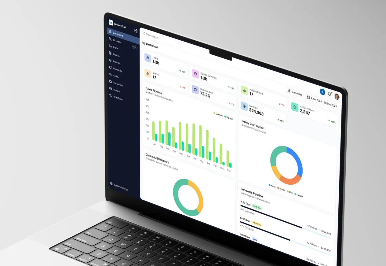
Reducing Insurance Operations Costs by 30% Through Intelligent Workflow Automation
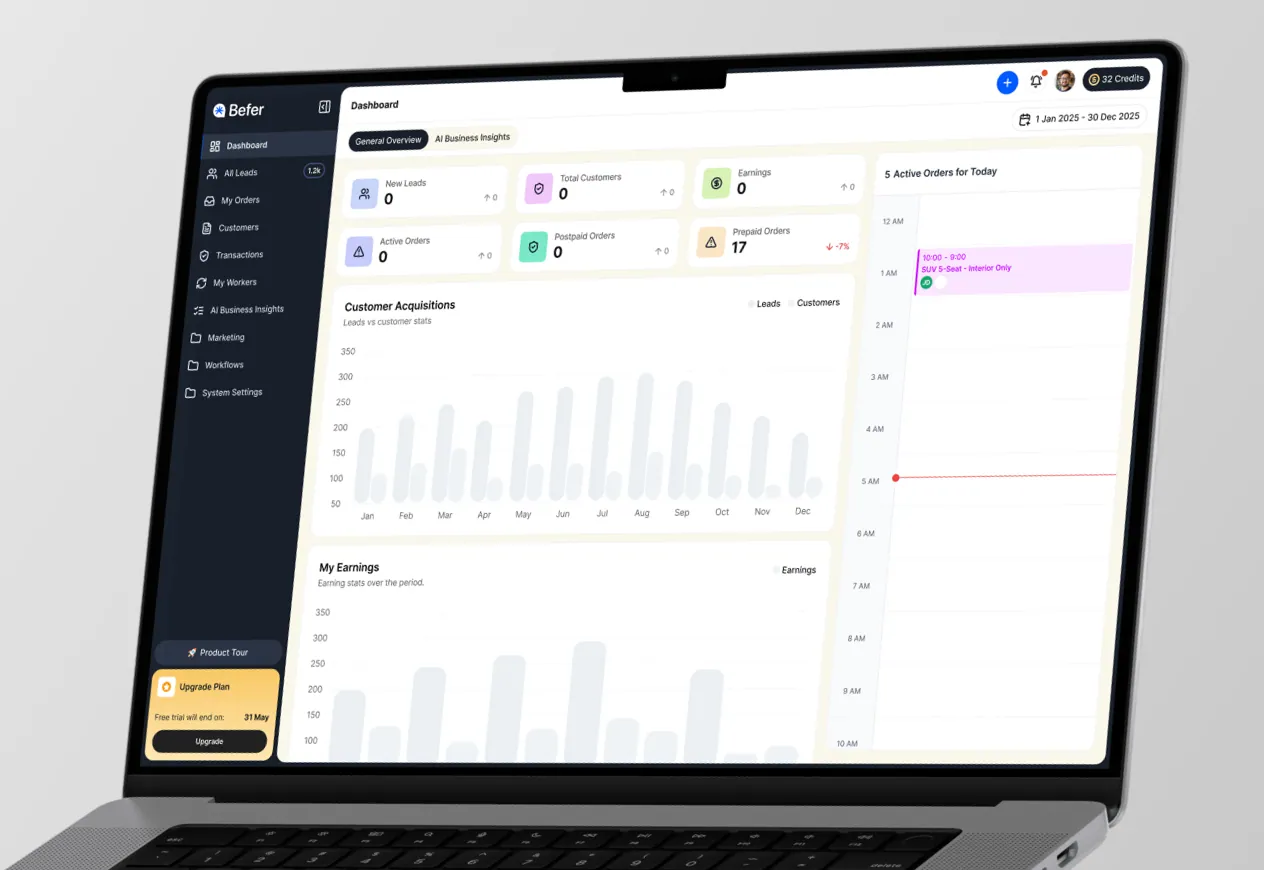
Boosting Lead Conversion Capacity by 300% with AI-Powered Service Automation
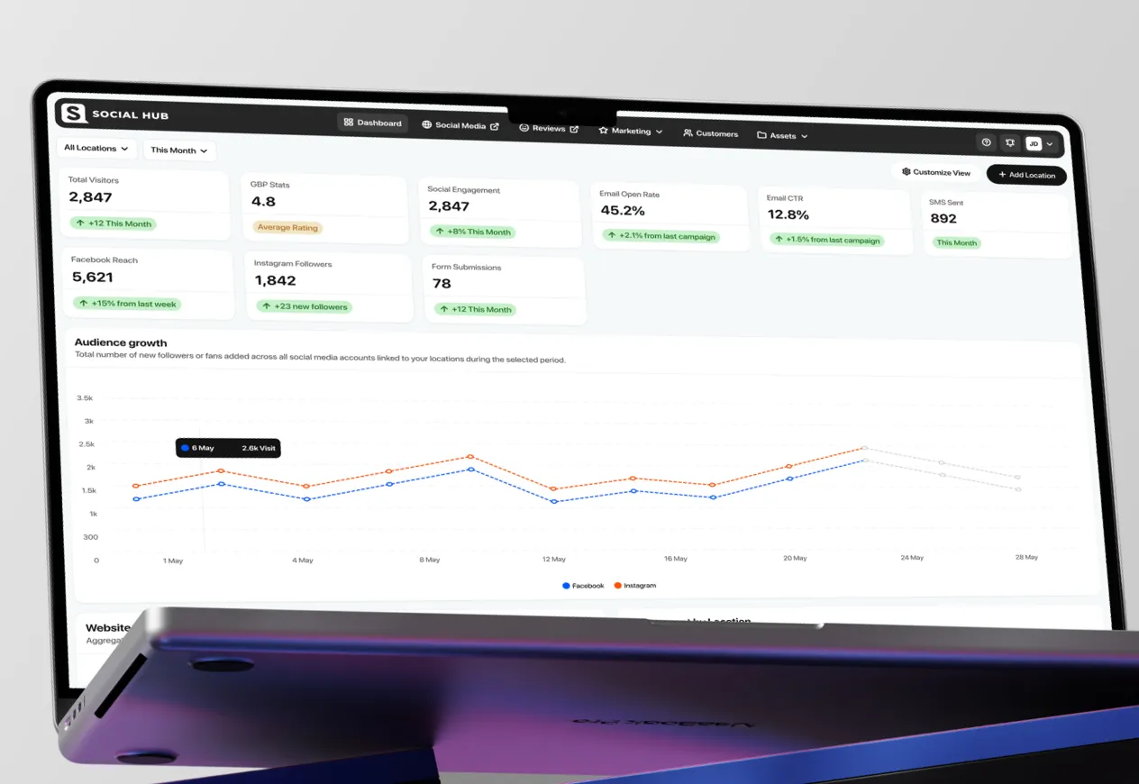
Driving 40% Higher Customer Engagement Through Restaurant Marketing Automation
Get insights into how technology can engineer transformative growth
Frequently asked questions
Industries we build this for
- RetailHATZS builds custom retail software for omnichannel retailers and consumer brands: POS and inventory integrations, ecommerce platforms, personalization engines and loyalty apps. By unifying store, warehouse and online inventory in real time, we helped Urban Cart cut cart abandonment by 42% and stockout incidents by 35%.
- HealthcareWe design and develop HIPAA-compliant healthcare platforms, telemedicine applications, EHR/EMR integrations, and patient engagement solutions. Our healthcare software empowers providers to deliver better patient outcomes through streamlined workflows, AI-powered diagnostics, and secure health data management.
- InsuranceWe handle insurance software development for carriers, brokers, and insurtechs: secure, scalable systems for policy management, claims automation, underwriting, and customer portals that cut costs and speed approvals.